
The Gladiators Are Bringing Maroon Back — And Honestly, It's About Time
If you've been an Atlanta Gladiators fan for more than a few seasons, you probably remember exactly where you were standing when navy, blue and gold took over. Some of you loved it. A lot of you never really let it go, and kept wearing your old gear to games anyway. Well, good news — you can put those jerseys back in regular rotation, because maroon is officially back.
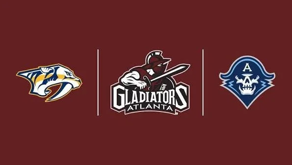
Photo: ECHL
So What Actually Happened?
The Gladiators pulled back the curtain on a brand-new colorway heading into the 2026-27 season: maroon, black and white. And when we say "new," we mean new-old, because this is essentially a callback to the exact look the team wore from 2003, when the franchise first landed in Gwinnett County, all the way through 2019. The logo isn't changing — it's the same Gladiators branding you already know — but the colors behind it are shifting back to where a lot of longtime fans always felt they belonged.
Team owner Alex Campbell made the announcement, and he didn't tiptoe around what's driving it. Heading into his fourth year owning the club, he pointed to real, measurable growth — bigger crowds, deeper community programs, a playoff berth, and by most accounts one of the best overall seasons the franchise has had. But he also made a point of saying this decision came straight from the fans. People had been asking for maroon back for years, and this time, ownership actually listened.
Not a Rebrand — A Revival
Here's the phrase the organization keeps coming back to, and it's a good one: this isn't a rebrand, it's a revival. Team president Jared Youngman put it simply — the goal was to blend the past with the present. Build toward what's next for the franchise without walking away from what made the Gladiators feel like the Gladiators in the first place.
And honestly, that distinction matters. Rebrands can feel disconnected, like a front office chasing a trend or trying to manufacture buzz. This feels more like the organization looking in the mirror, recognizing what fans actually connected with, and giving it back to them with a fresh coat of paint.
What Each Color Is Supposed to Represent
The team didn't just swap colors and call it a day — they gave each one real meaning, and it's worth breaking down:
Maroon stands for tradition, passion and sacrifice — a nod to fans who've been packing the building since 2003 to watch this team leave everything on the ice.
Black represents strength, toughness and competitive spirit, the qualities the organization wants reflected in everyone from the players to the front office to the people in the stands.
White is about integrity, excellence and unity — upholding the sport the right way and chasing greatness together, not separately.
It's a small thing, maybe, but giving the colors an actual identity instead of just picking whatever looked good is the kind of detail that tells you this wasn't a rushed decision.
New Jerseys, Same Gladiators
Along with the new colorway, the team unveiled a full set of home, away and alternate jerseys for the upcoming season. Fans got their first real look at the sweaters, and the response has been exactly what you'd expect from a fanbase that's been quietly hoping for this moment for years — pure excitement. The new look will officially hit the ice for the first time at the Gladiators' home opener on Saturday, October 17, when Atlanta hosts Norfolk.
Why This Actually Matters
It's easy to brush this off as "just a jersey," but for minor league hockey especially, identity is everything. These franchises live and die by the connection they build with their community, and nothing signals that connection quite like an organization actually listening when fans say "bring back the old colors." This wasn't corporate. It wasn't a marketing team chasing a trend. It was ownership hearing years of requests and finally saying yes.
Coming off one of the most successful seasons in franchise history, with attendance climbing and the team pushing deep into the Kelly Cup Playoffs, the timing couldn't be better. Maroon isn't just a color for this organization — it's the color a whole generation of Atlanta hockey fans grew up on. And now, it's back where it belongs.